Ohana Real Estate
A property website that helps buyers find their place in the Spanish sun.
Requirements
To design a website for a family-run estate agency on the Costa Blanca and Costa Cálida that makes finding a home in Spain simple for buyers from across Europe.
Approach
I started with competitor research into the big property portals, then designed search, listings, the map and property details around the questions buyers ask first: where, how much and how many bedrooms.
Why it mattered
Most Ohana buyers are moving from the UK, the Netherlands and further afield. A clear, bilingual site builds the trust that a personal, family-run agency depends on.
Homepage
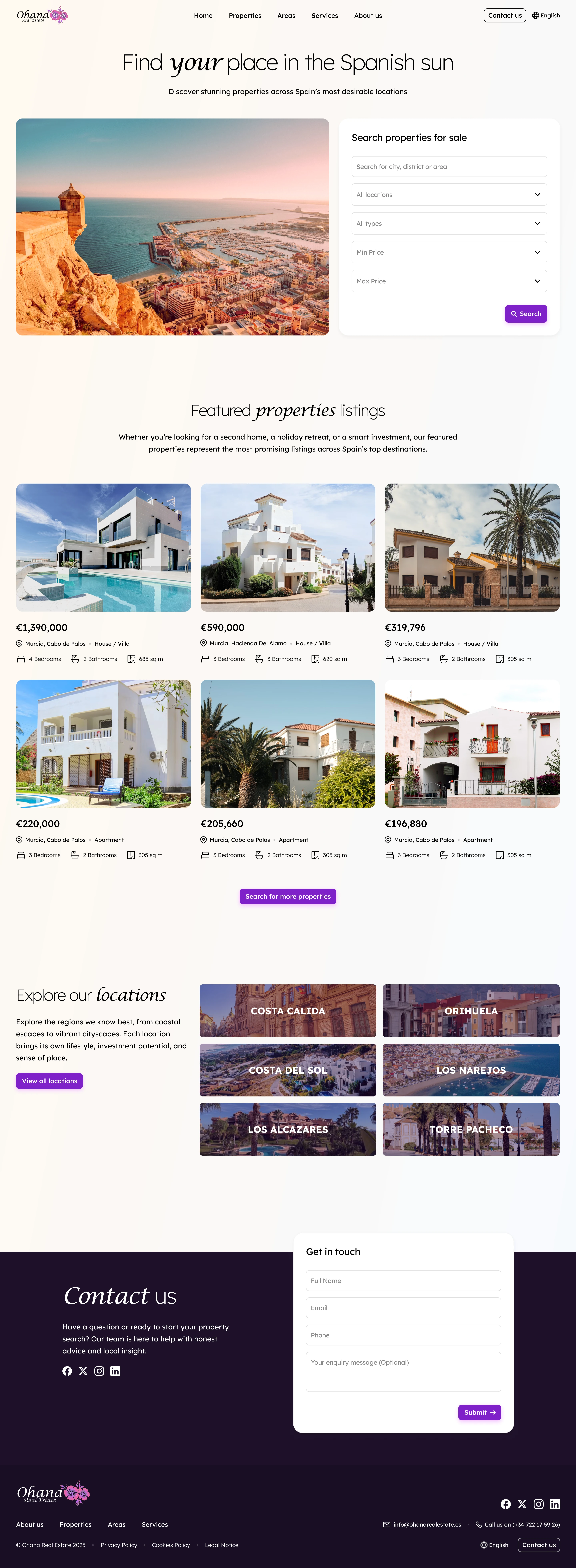
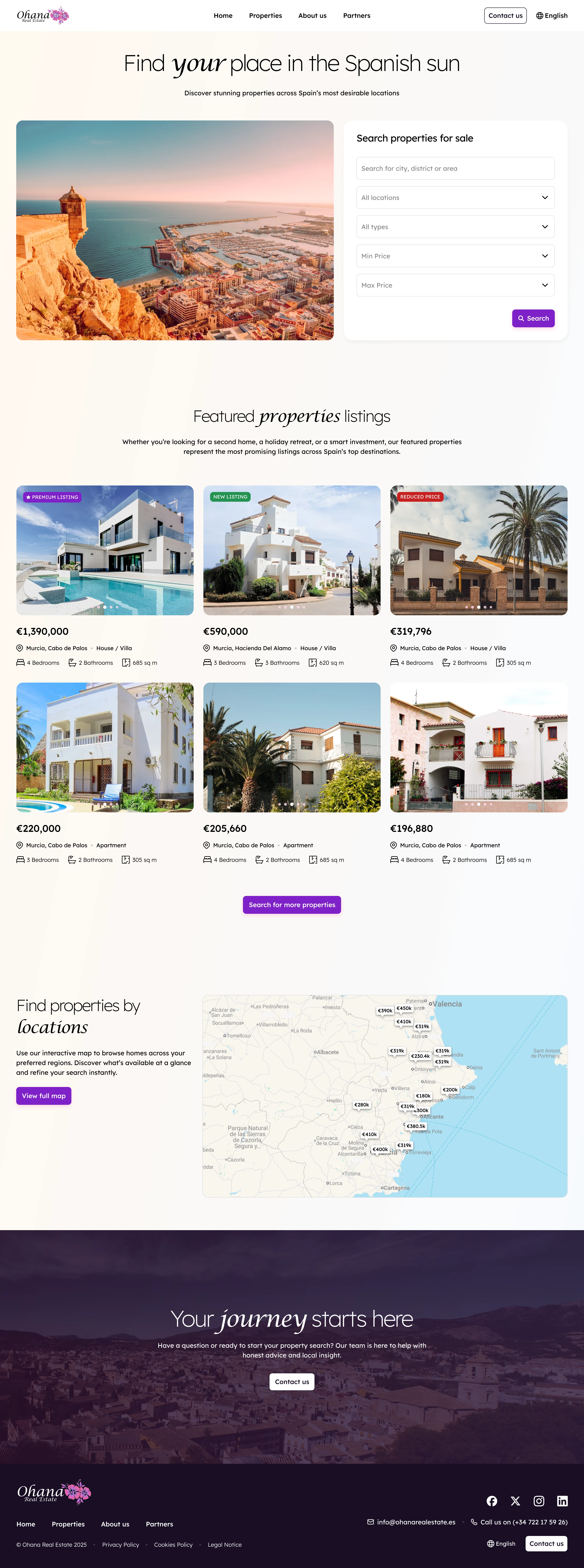
Search first
The homepage opens with search: location, property type and price, so buyers can start straight away. Featured properties follow, each card showing price, town, bedrooms, bathrooms and size.
Below, the towns Ohana covers, from Torrevieja to Cartagena, the team behind the agency and an easy way to get in touch.
Listings
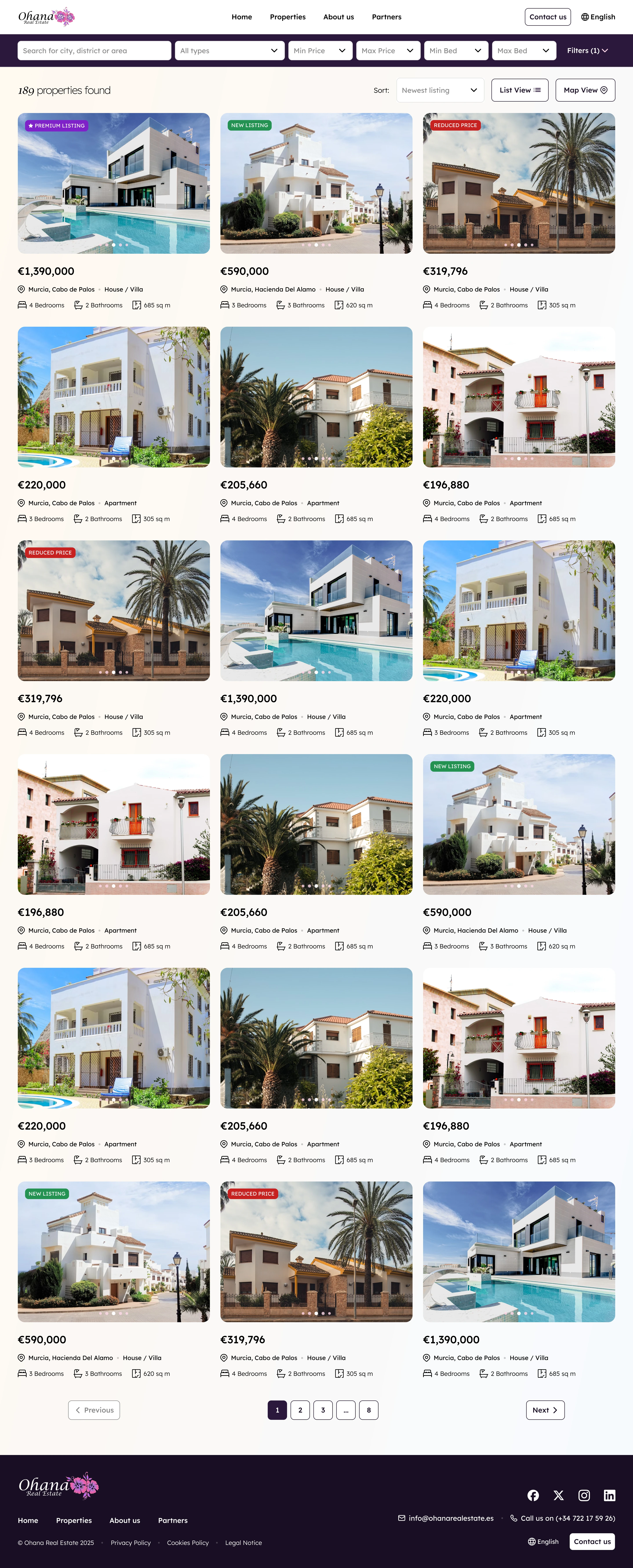
Properties grid
A grid of every property for sale, with filters for location, type, price, bedrooms and bathrooms that stay in reach while buyers scroll.
Cards carry the same details in the same order every time, so buyers can compare homes at a glance.
Details
Property details and map
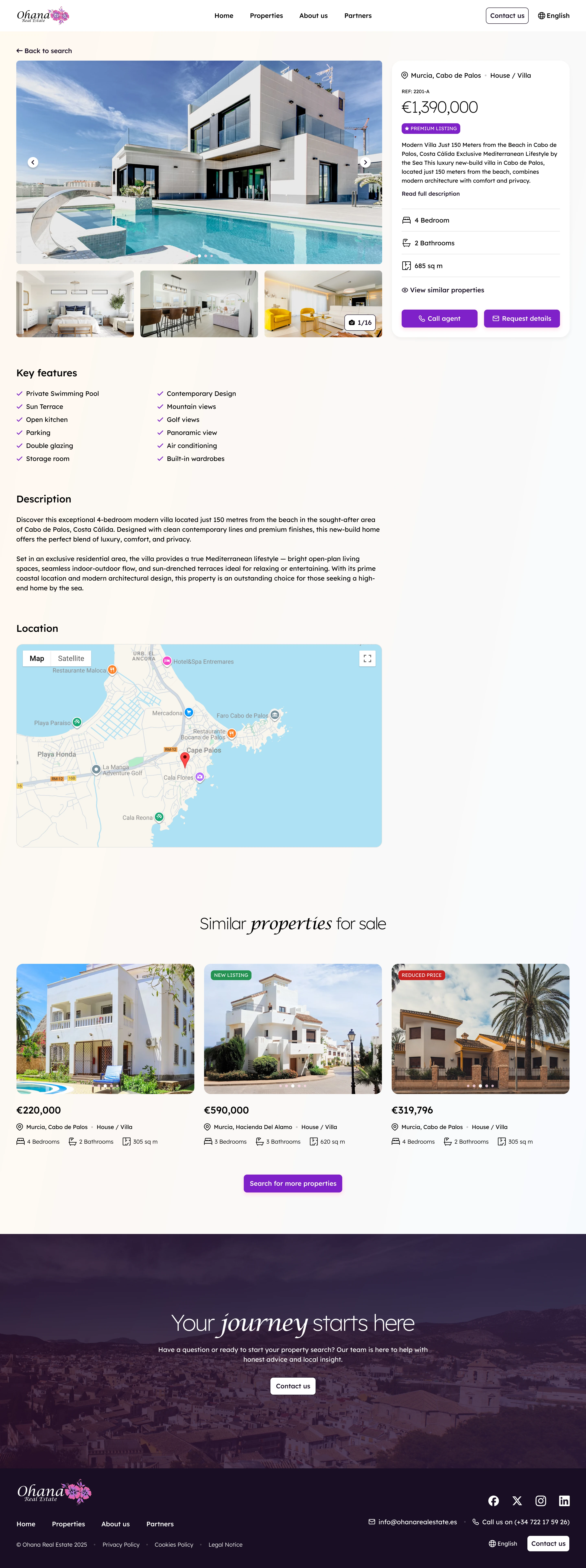
The property page leads with a large gallery, then price, key facts, the description and features, with an enquiry form beside them that stays in view.
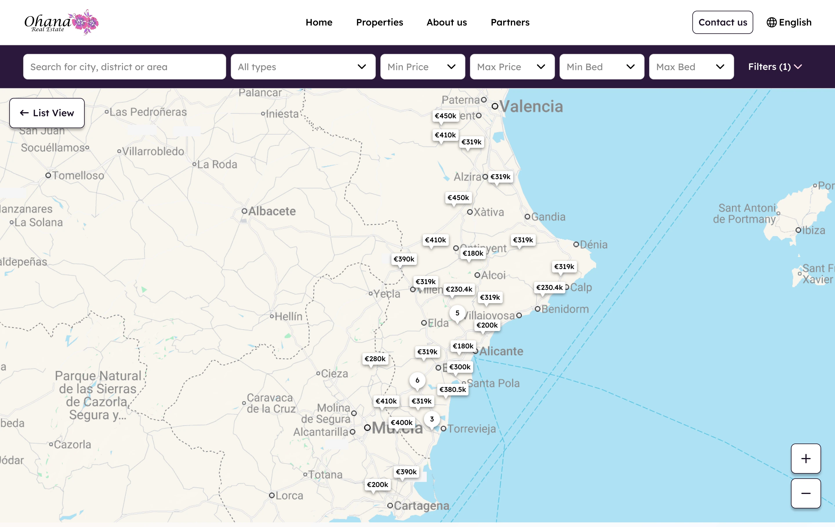
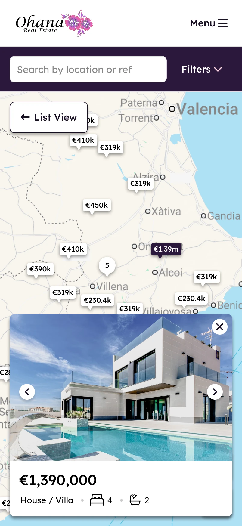
A map view shows every property by location. Tapping a pin opens a card with the photo, price and key facts, on desktop and on mobile.

Mobile
Mobile templates
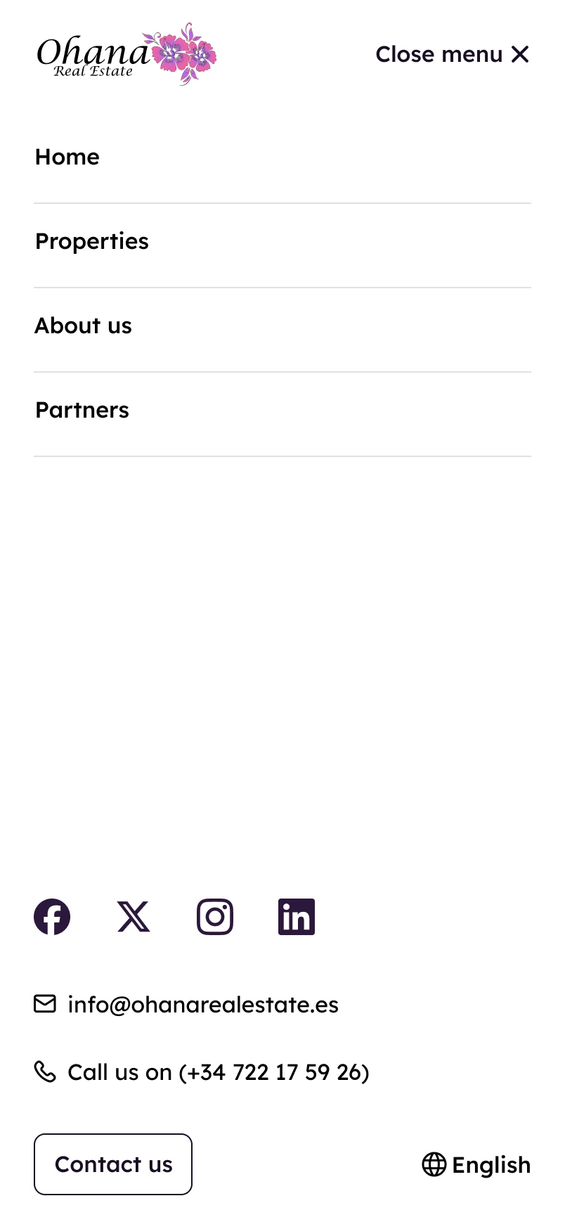
Every template is designed for phones too: the homepage, properties, about and the menu, built from the same components as the desktop site.



Concepts
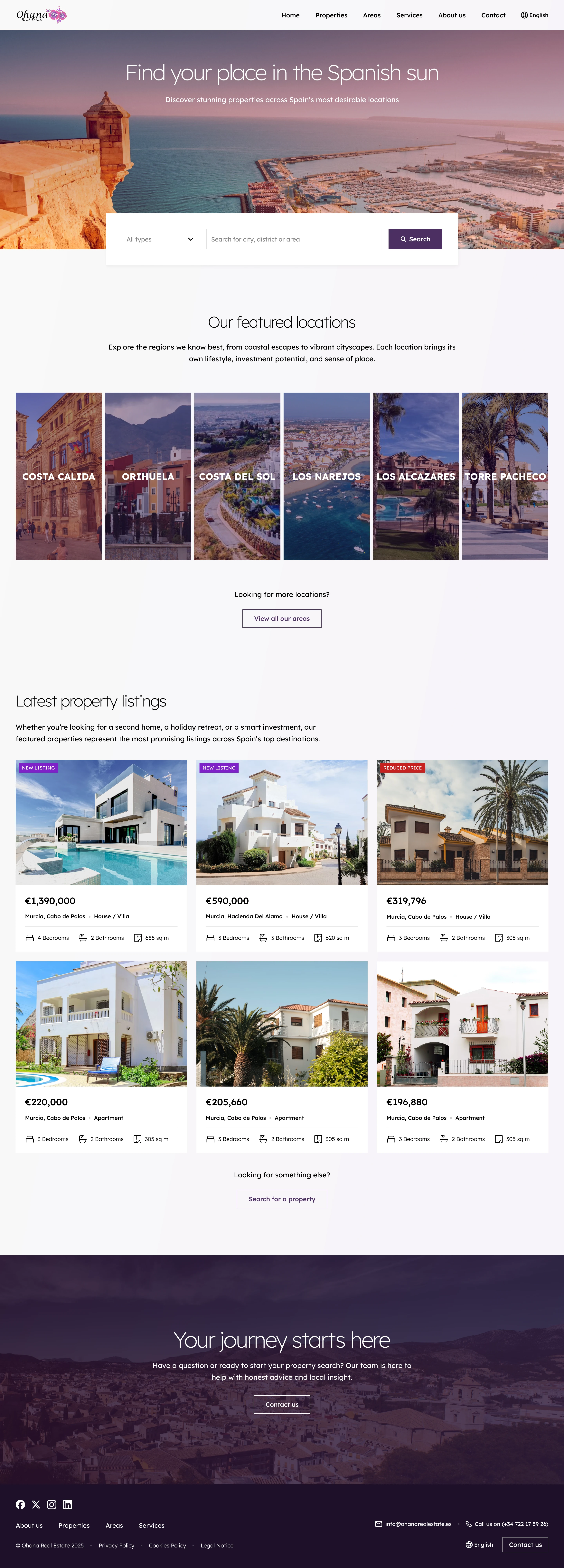
Two homepage concepts
Before settling the design, I explored two homepage directions: one led by large photography and the coastline, one led by featured properties and search.
Both share the same navigation, cards and footer, so either could be built on the same system.